A pattern we often see at data teams: exploration happens on a laptop in one tool, and once the dataset outgrows the laptop, the pipeline is rewritten in a second tool that scales. From that point on the team maintains two implementations of the same logic, and the two tend to drift apart. Every change has to be made twice, and once the implementations drift, the dashboard and the notebook start disagreeing about the same number.
This post shows a workflow without the rewrite. We take a subset of a large dataset, explore it locally, and build an ETL pipeline from what we find. Then we run the exact same Polars queries on the full month of Polymarket orderbook data, 16 billion rows, on Polars Cloud. What changes between the laptop and the cluster is the method call that decides where execution happens. The results feed a Plotly Dash dashboard hosted on Plotly Cloud.
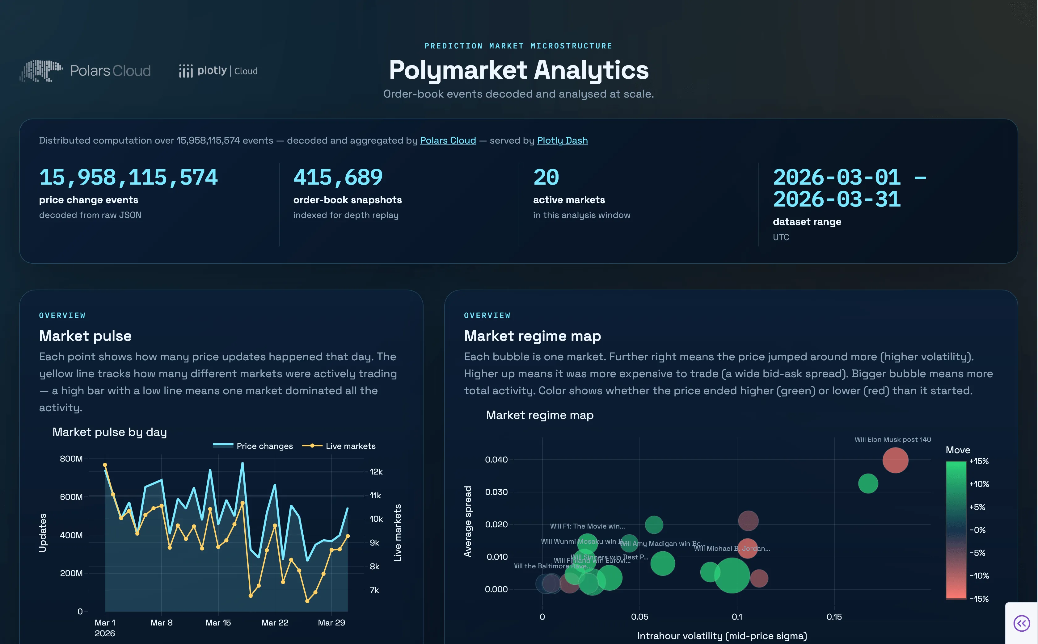
The dashboard the pipeline feeds, live to explore.
The workflow
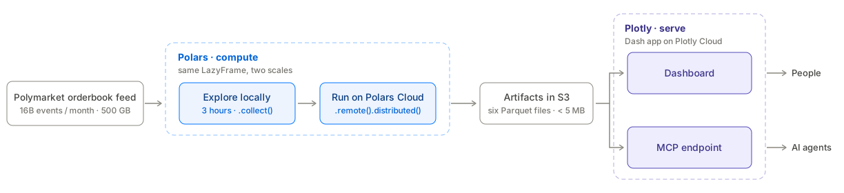
Our example data comes from Polymarket, a prediction market where users trade on the outcomes of real-world events. It publishes its full orderbook as a public dataset: every price update, for every active market, logged with a millisecond timestamp. One hour of that data is around 30 million rows, and the three hours we prototype on total 97 million, which still runs comfortably on a laptop. One month is 16 billion rows in around 500 GB of compressed Parquet, which requires larger machines.
Raw orderbook events land in S3 as hive-partitioned Parquet. Polars transforms that raw data into the smaller files that back each plot. A subset of a few hours has the same shape as the full month, so one LazyFrame serves both scales: collected locally while prototyping, then run distributed on Polars Cloud against the full month. Its output is a handful of small, pre-aggregated Parquet artifacts in S3. Plotly handles visualisation and serving: a Dash app on Plotly Cloud reads those artifacts to power the dashboard and an MCP endpoint. The two halves meet at the artifacts.
We built this project together with the Plotly team, and the write-up spans two posts. This one covers the compute half: decoding, aggregating, and scaling the data with Polars.
The companion post on the Plotly blog (that will come out on Thursday) covers the serve half: hosting the dashboard on Plotly Cloud, keeping it responsive, and exposing it to AI agents over MCP. The rest of this post walks through the Polars half of that diagram, from raw events to artifacts.
Step 1: explore a subset locally
We scope to the first three hours of the month before writing any pipeline code. That is enough data to work out the schema, the payload format, and the transformations the dashboard needs, with the fast feedback of local execution. It is also deliberately more than one hour: an hour is a single leaf partition, while three hours span multiple partitions, so the subset has the same structure as the full month and the query already handles the multi-file scan it will meet at scale.
import polars as pl

pl.Config.set_engine_affinity("streaming")

storage_options = {"aws_region": "us-east-1"}

lf = pl.scan_parquet(
    [
        f"s3://bucket/raw/orderbook/year=2026/month=03/day=01/hour={h:02d}/*.parquet"
        for h in range(3)
    ],
    storage_options=storage_options,
)
print(lf.collect_schema())
# Output
# Schema({'timestamp_received': Datetime(time_unit='ms', time_zone='UTC'),
#         'timestamp_created_at': Datetime(time_unit='ms', time_zone='UTC'),
#         'market_id': String, 'update_type': String, 'data': String})
collect_schema resolves column names and dtypes from the file metadata without reading any data, so it is the cheapest first look at an unfamiliar dataset.
To see actual values, pull a single row and glimpse it:
lf.head(1).collect().glimpse()
# Output
# Rows: 1
# Columns: 5
# $ timestamp_received   <datetime[ms, UTC]> 2026-03-01 00:00:00.012 UTC
# $ timestamp_created_at <datetime[ms, UTC]> 2026-03-01 00:00:00.009 UTC
# $ market_id                         <str> '0x00000977017…'
# $ update_type                       <str> 'price_change'
# $ data                              <str> '{"asset_id":"71321…","hash":"0x…","side":"NO",…'
glimpse prints one row per column, so the wide data payload stays readable instead of being squashed into a table cell.
Tip: set streaming affinity once, affect all collects
set_engine_affinity is a global config. Call it once at module load and every .collect() in that process uses the streaming engine, which processes data in chunks and keeps memory bounded on scans larger than RAM. It will become the default engine in an upcoming release.
Each row is a raw event: two timestamps, a market_id, an update_type, and a data column holding a JSON payload.
A value_counts shows two event types: price_change, which fires whenever the best bid or ask on a market moves, and the much rarer book_snapshot, which we only use for the dashboard’s depth chart.
The price_change payload holds eight JSON keys, of which we need three.
Polars decodes them inline with str.json_decode and a pl.Struct schema that declares only those three fields, so the rest is never parsed, and casts the string-quoted prices to Float64 along the way.
The side column becomes a pl.Enum, a categorical type with a fixed set of values that is safe to use across distributed workers.
We build a single LazyFrame, price_changes, that filters, decodes, and computes the spread:
PRICE_CHANGE_SCHEMA = pl.Struct({
    "side": pl.String,
    "best_bid": pl.String,
    "best_ask": pl.String,
})

price_change_expr = pl.col("data").str.json_decode(PRICE_CHANGE_SCHEMA)
price_changes = (
    lf.filter(pl.col("update_type") == "price_change")
    .select(
        "timestamp_received",
        "market_id",
        price_change_expr.struct.field("side").cast(pl.Enum(["YES", "NO"])),
        price_change_expr.struct.field("best_bid").cast(pl.Float64),
        price_change_expr.struct.field("best_ask").cast(pl.Float64),
    )
    .with_columns(
        (pl.col("best_ask") - pl.col("best_bid")).alias("spread")
    )
)

df = price_changes.collect()
print(df.head(3))
# Output
# shape: (3, 6)
# ┌─────────────────────────────┬────────────────┬──────┬──────────┬──────────┬────────┐
# │ timestamp_received          ┆ market_id      ┆ side ┆ best_bid ┆ best_ask ┆ spread │
# │ ---                         ┆ ---            ┆ ---  ┆ ---      ┆ ---      ┆ ---    │
# │ datetime[ms, UTC]           ┆ str            ┆ enum ┆ f64      ┆ f64      ┆ f64    │
# ╞═════════════════════════════╪════════════════╪══════╪══════════╪══════════╪════════╡
# │ 2026-03-01 00:38:27.967 UTC ┆ 0x00000977017… ┆ NO   ┆ 0.984    ┆ 0.991    ┆ 0.007  │
# │ 2026-03-01 00:38:27.967 UTC ┆ 0x00000977017… ┆ YES  ┆ 0.009    ┆ 0.016    ┆ 0.007  │
# │ 2026-03-01 00:38:27.967 UTC ┆ 0x00000977017… ┆ NO   ┆ 0.984    ┆ 0.991    ┆ 0.007  │
# └─────────────────────────────┴────────────────┴──────┴──────────┴──────────┴────────┘
Prediction market prices
Prices are probabilities between 0 and 1.
A YES price of 0.72 means the market prices a 72% chance the event resolves YES.
Each market side has a best bid and a best ask, and the spread is the gap between them: narrow in active, liquid markets, wide where trading is thin.
A few group-bys settle the design questions.
Activity is heavily skewed: a small set of liquid markets accounts for most of the events, while thousands of markets barely trade.
Users will want to drill into one liquid market’s history or scan across markets to compare them.
Both views filter on market_id and a timestamp range, so those are the two axes the pipeline output has to be cheap to slice along.
Step 2: shape small artifacts for the app
The dashboard is a web app that could serve many concurrent users, and running a full scan of 16 billion raw events on every page load is not viable. So the heavy aggregation runs ahead of time as a batch job on Polars Cloud, and the dashboard reads only its output.
Tip: separate compute from serve
Run the heavy aggregation once, on a schedule or on demand, and write the results as small artifacts. The app reads only those artifacts, so a page load never scans the raw dataset. The cost of the big scan is paid once per refresh instead of once per visitor.
The pipeline runs in two stages. Stage 1 is the decode we built while exploring: it filters, decodes, and casts the raw events, and sinks the typed result to an intermediate prefix on S3. Stage 2 scans those intermediates, so each aggregation job works with typed columns instead of re-parsing JSON strings:
price_changes = pl.scan_parquet(
    "s3://bucket/artifacts/_intermediate/price_changes/",
    storage_options=storage_options,
)
From that one LazyFrame, Stage 2 writes six artifacts, one per dashboard view:
| Artifact | Grain | Dashboard view |
|---|---|---|
market_profile.parquet | one row per market: spread stats, mid volatility, activity rank | leaderboard and market stats |
activity_pulse.parquet | global event counts per 1-minute bucket | activity timeline |
activity_heatmap.parquet | event counts by hour-of-day, top 100 markets | activity heatmap |
prices.parquet | 1-minute bid/ask per market, YES side, sorted by market_id | price and spread charts |
depth_chart/ | order book snapshots, flat rows per price level | depth chart replay |
market_names.parquet | one row per market | human-readable names |
The heaviest artifact is under 5 MB, so clicking through markets never triggers a scan of the raw data.
All six jobs are the same shape: filter, group_by, agg, sink_parquet.
One is enough to show the pattern.
Here is the activity pulse:
activity_pulse = (
    price_changes.with_columns(
        pl.col("timestamp_received").dt.truncate("1m").alias("minute_bucket")
    )
    .group_by("minute_bucket")
    .agg(
        pl.len().alias("events"),
        pl.n_unique("market_id").alias("live_markets"),
    )
    .sort("minute_bucket")
)

# Stream the aggregation straight to disk, no full in-memory collect.
activity_pulse.sink_parquet("artifacts/activity_pulse.parquet")

# Read a few rows back to check the result.
print(pl.scan_parquet("artifacts/activity_pulse.parquet").head(3).collect())
# Output
# shape: (3, 3)
# ┌─────────────────────────────┬────────┬──────────────┐
# │ minute_bucket               ┆ events ┆ live_markets │
# │ ---                         ┆ ---    ┆ ---          │
# │ datetime[ms, UTC]           ┆ u64    ┆ u64          │
# ╞═════════════════════════════╪════════╪══════════════╡
# │ 2026-03-01 00:00:00 UTC     ┆ 528010 ┆ 13275        │
# │ 2026-03-01 00:01:00 UTC     ┆ 528580 ┆ 12127        │
# │ 2026-03-01 00:02:00 UTC     ┆ 527752 ┆ 12612        │
# └─────────────────────────────┴────────┴──────────────┘
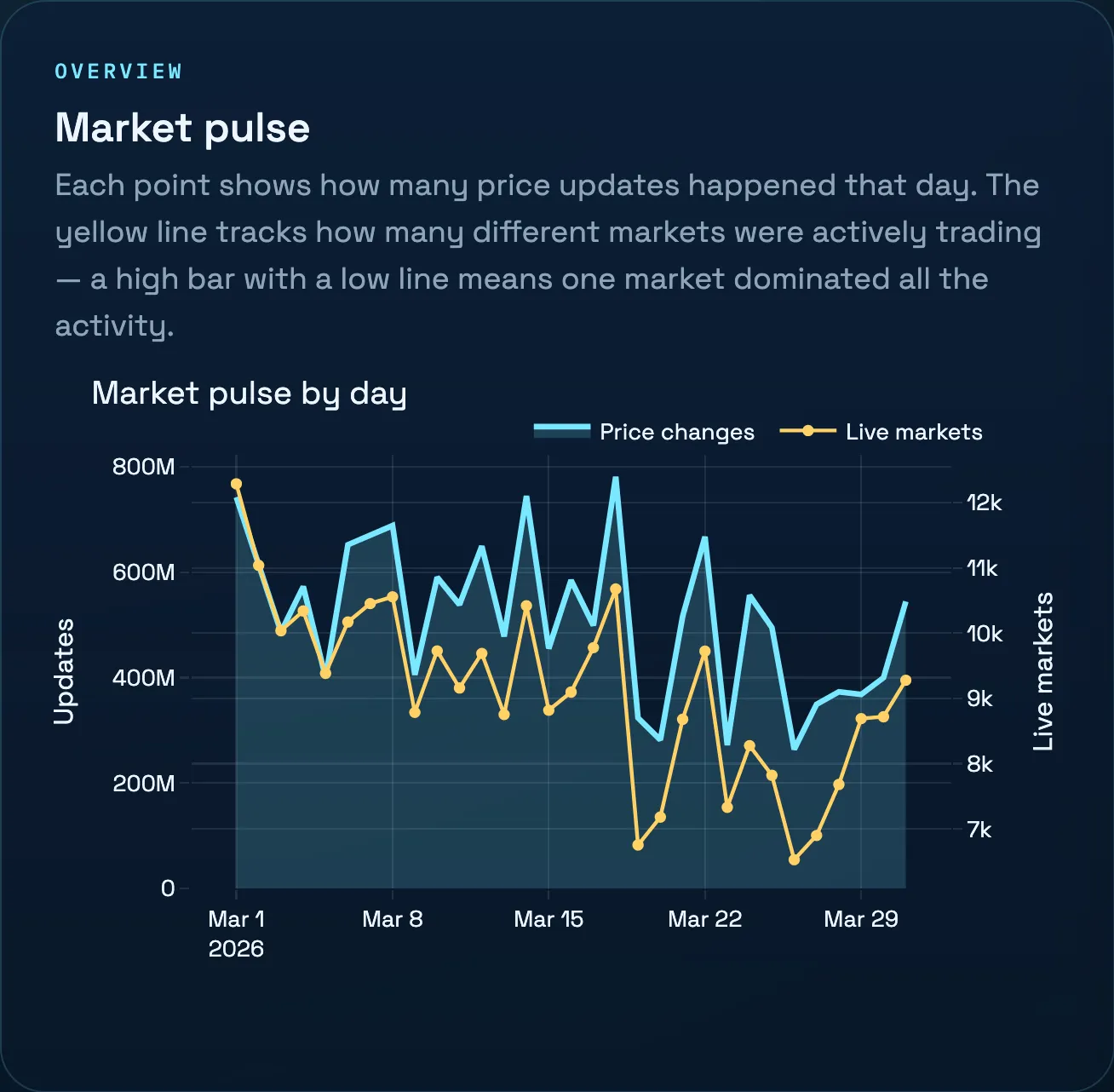
Half a million events per minute is around 8,800 price updates per second, spread across more than 13,000 markets trading at once.
Tip: dt.truncate + group_by instead of group_by_dynamic
group_by_dynamic requires the index column to be sorted, which on unsorted data means a global sort: expensive, and hard to distribute. Truncating a timestamp to a bucket and using a plain group_by produces the same result for non-overlapping tumbling windows, with one caveat: buckets without events are omitted instead of appearing as zero rows. It is fully partitionable: each worker can aggregate its own chunk independently.
That partitionability is the reason this code runs unchanged on the cluster in the next step.
Step 3: run the same query on the full dataset
The full dataset covers one month of trading: 16 billion raw events in 500 GB of compressed Parquet. This is too much for a laptop, so we scale up to a cluster. The pipeline code stays the same. The only difference is how the query executes.
The compute context points at a cluster definition registered once in the workspace, in our case eight r8g.4xlarge workers, and every job in the pipeline shares it:
import polars_cloud as pc

pc.authenticate()

ctx = pc.ComputeContext(workspace="my-workspace", name="polymarket-pipeline")
ctx.start()
With the context running, moving a query to the cluster is one change to the call:
# Local: single-node streaming execution on the three-hour subset
activity_pulse.sink_parquet("artifacts/activity_pulse.parquet")

# Cloud: the same query, distributed across the cluster on the full month
activity_pulse.remote(ctx).sink_parquet(
    "s3://bucket/artifacts/activity_pulse.parquet",
    sink_to_single_file=True,
    storage_options=storage_options,
)
The LazyFrame is the same object in both calls.
remote(ctx) hands it to Polars Cloud, which distributes the scan and aggregation across the cluster.
A distributed sink writes its output as multiple files by default, and sink_to_single_file=True merges it into one.
The decode we wrote to eyeball three hours of data now processes 16 billion rows, and there is no second implementation to keep in sync with the prototype.
When the last job finishes, ctx.stop() shuts the cluster down.
Every remote query also shows up in the Polars Cloud dashboard with its own Query Details view: wall time, rows read, per-stage progress, and a stage graph of how the scans, group-bys, and joins were spread across the cluster. The market profile job below read 24 billion rows across its scans and finished in 2m 51s of wall time, packing 18 minutes of node time into that window. When a job is slower than expected, the query profiler is where you find the bottleneck.
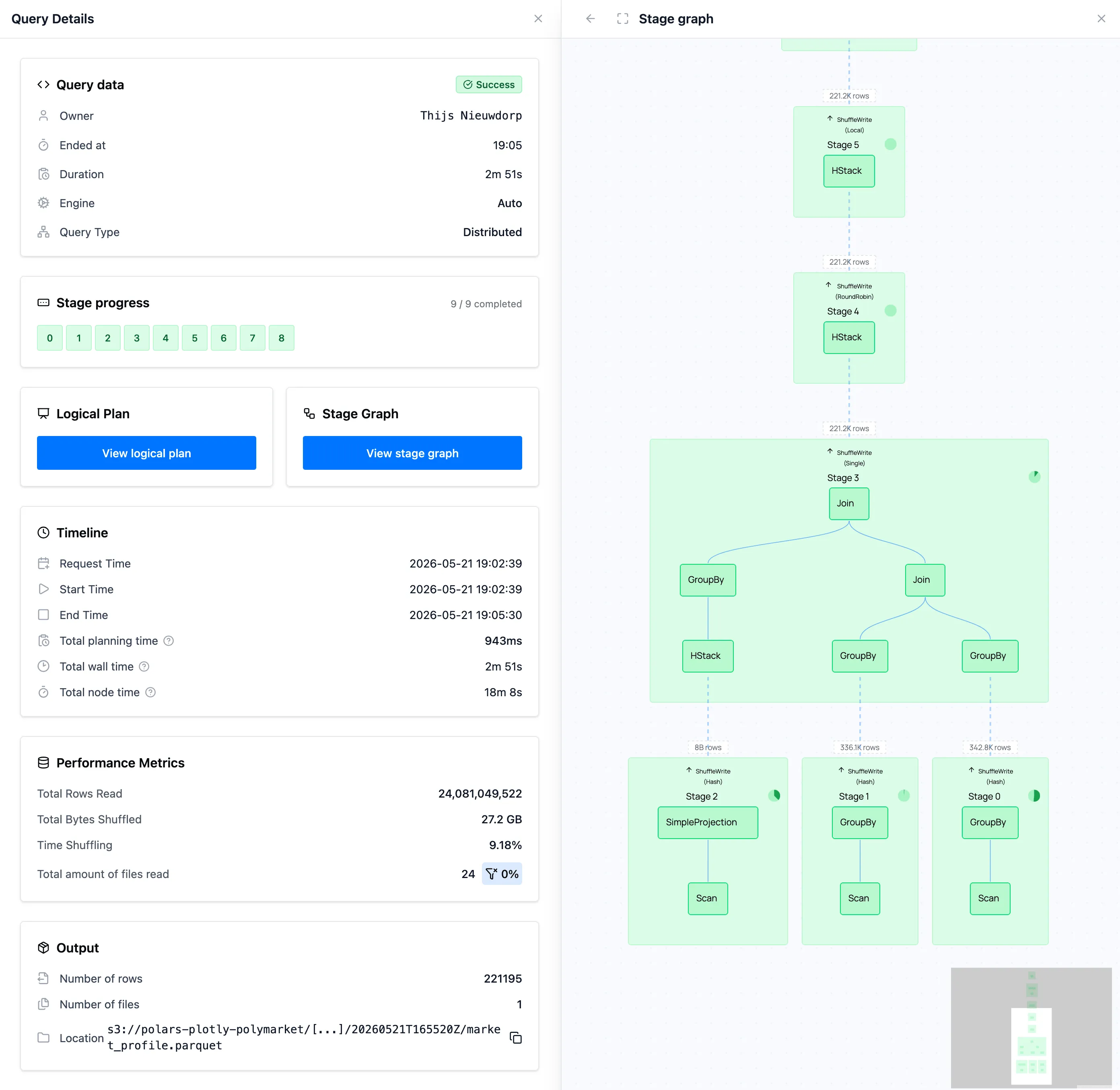
The market profile job in Polars Cloud: 24 billion rows read, nine stages, 2m 51s wall time.
The workflow is not tied to our managed cloud either. Polars Distributed also runs on your own Kubernetes cluster, so the same laptop-to-cluster step works entirely inside your own infrastructure.
After all six jobs complete, we write a manifest.json to S3 with the artifact paths for the current run to mark its completion.
The dashboard reads the manifest on startup.
Rerunning the pipeline produces a new run ID, writes new artifacts under a new prefix, and swaps the manifest last with a single S3 PUT of one key, which S3 applies atomically.
The dashboard therefore always reads a consistent set of artifacts, never a mix of old and new files captured mid-update, and picks up a new run when it restarts.
Step 4: hand the artifacts to Plotly Dash
This section covers the boundary between the pipeline and the app.
The full dashboard layout, chart code, and Plotly Cloud deployment are in the companion post on the Plotly blog (coming out on Thursday).
The dashboard reads the manifest on startup and loads the global artifacts (market profile, activity pulse) into memory.
Per-market data is fetched on demand.
prices.parquet is written with sink_to_single_file=True and sorted by market_id, so filtering to a single market lets the Parquet reader skip row groups that cannot match.
Results are cached on the Plotly Cloud instance with @lru_cache so each market is read from S3 at most once:
from functools import lru_cache

@lru_cache(maxsize=128)
def query_price_and_spread_data(market_id: str) -> pl.DataFrame:
    return (
        pl.scan_parquet(artifact_url("prices.parquet"), storage_options=storage_options)
         .filter(pl.col("market_id") == market_id)
         .collect()
)Parquet files store row-group statistics (min/max per column). When a query filters on market_id, the reader checks those statistics and skips row groups whose range cannot contain the target value, before reading any data. Sorting the file by market_id before writing concentrates each market’s rows into a few row groups, which maximises the skipping.
Dash callbacks pass the resulting Polars DataFrame directly to Plotly figure constructors:
@app.callback(
    Output("price-chart", "figure"),
    Output("spread-chart", "figure"),
    Input("market-dropdown", "value"),
)
def update_selected_market(market_id):
    df = query_price_and_spread_data(market_id)
    label = market_name(market_id)
    return price_chart_figure(df, label), spread_chart_figure(df, label)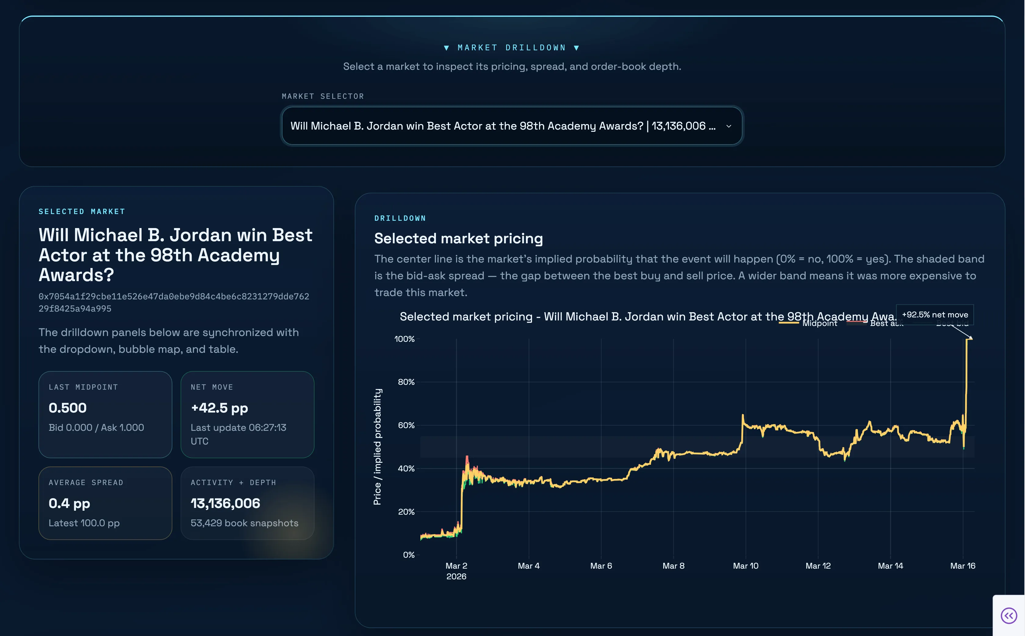
Serving has its own operational concerns, and on Plotly Cloud they are settings on the app rather than infrastructure to operate.
Keeping the app Always-On means the @lru_cache above survives across requests and visitors, so a market read once stays warm for everyone instead of being rebuilt from S3 after a cold start.
The same app doubles as an MCP server, so AI agents can query the artifacts through the app’s callbacks, with access governed by the same sharing settings that decide who can open the dashboard in a browser.
The companion post covers both in detail, along with publishing and machine sizing.
The same work, scaled
Explore a subset locally, with fast feedback, until the decode and the aggregations are right.
Run the same LazyFrames on the full dataset with .remote(ctx), on Polars Cloud or on your own cluster.
Serve small pre-aggregated artifacts to a Plotly Dash app, so no page load touches the raw data.
Polars transforms the data, and Plotly Dash visualizes and serves it, with a handful of small Parquet files in S3 as the interface between them.
Explore the live dashboard, and see the companion Plotly blog post (coming out on Thursday) for how it is built and hosted on Plotly Cloud. You can run the same pattern on your own data with Polars Cloud.